
Almirall Ilumetri®
Website Design
Almirall Ilumetri®
Website Design
Almirall Ilumetri is an education programme that was developed to enable knowledge sharing among customers and provide educational content for medical professionals namely in the dermotology specialism.
Almirall Ilumetri is an education programme that was developed to enable knowledge sharing among customers and provide educational content for medical professionals namely in the dermotology specialism.
Almirall Ilumetri is an education programme that was developed to enable knowledge sharing among customers and provide educational content for medical professionals namely in the dermotology specialism.
Client
Almirall
Role
UX/UI Designer
Brief
Update the look and navigation of the Ilumteri section of the Almirallmed website.
Client
Almirall
Role
UX/UI Designer
Brief
Update the look and navigation of the Ilumteri section of the Almirallmed website.
Client
Almirall
Role
UX/UI Designer
Brief
Update the look and navigation of the Ilumteri section of the Almirallmed website.
Challenge
Challenge
The main issue was to improve and organise site navigation. Due to the clinical healthcare nature of the site, a logical hierarchy needed to be established with all the relevant content in a simplified and collated under one uniform look and feel to allow ease of use for Health Care Practitioner.
The main issue was to improve and organise site navigation. Due to the clinical healthcare nature of the site, a logical hierarchy needed to be established with all the relevant content in a simplified and collated under one uniform look and feel to allow ease of use for Health Care Practitioner.

Solution
Solution
A simplified navigation was created to get to relevant information faster with an easier hierarchical structure based on HCP queries.
A simplified navigation was created to get to relevant information faster with an easier hierarchical structure based on HCP queries.
Design Process
Design Process
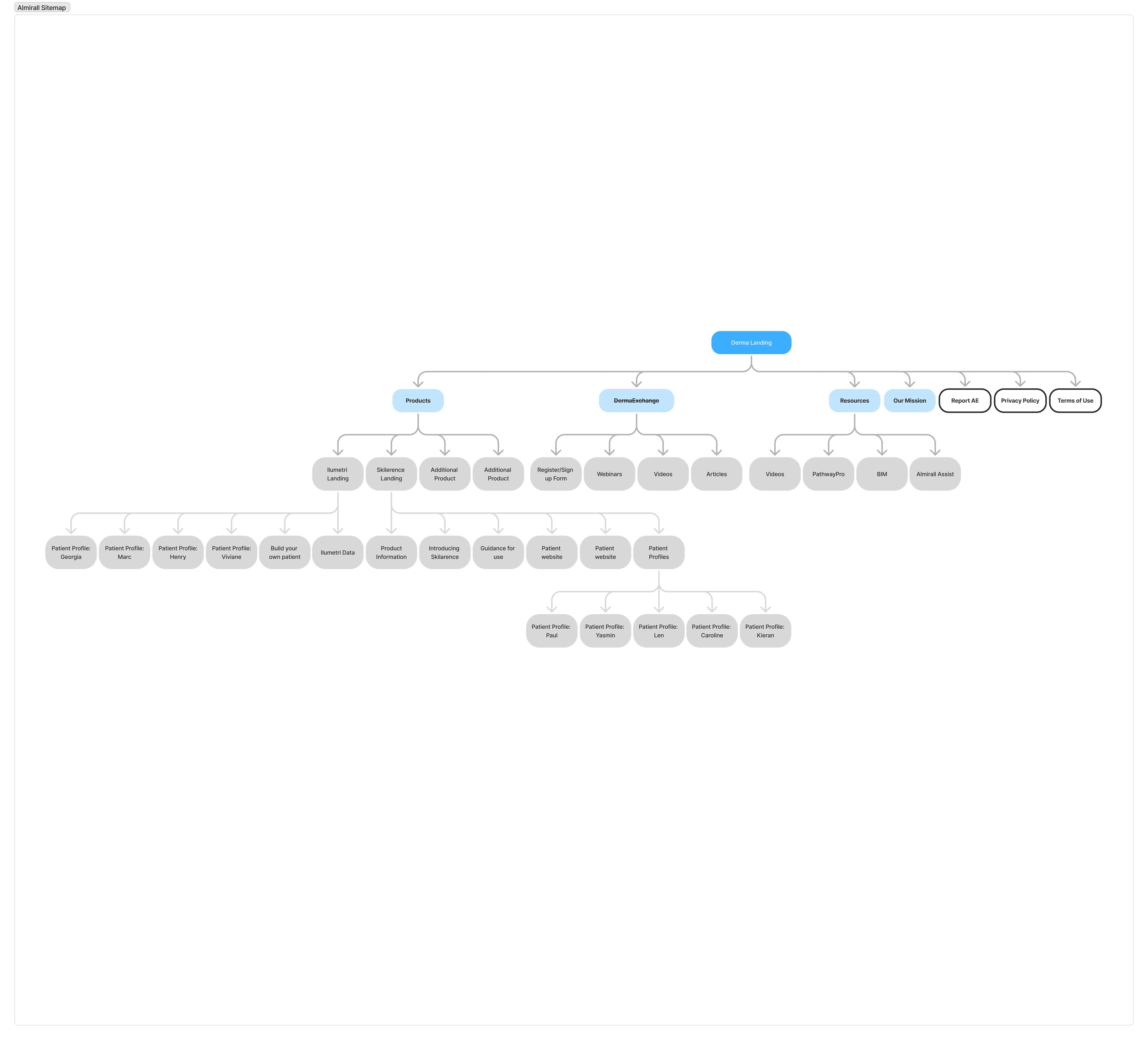
A new sitemap was created based on the research gathered around personas and user pain points that better ensure ease of navigation.
A new sitemap was created based on the research gathered around personas and user pain points that better ensure ease of navigation.
SITEMAP
PERSONA
Wireframes
Wireframes
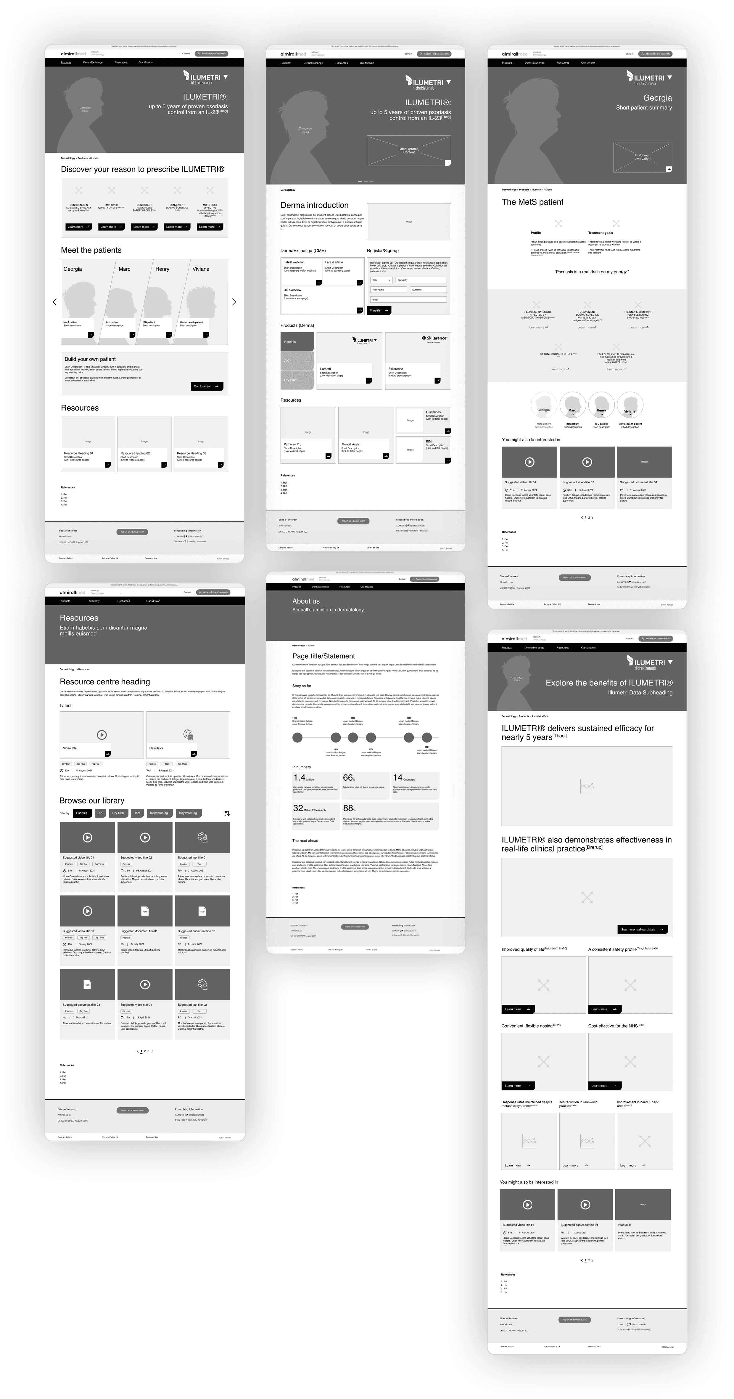
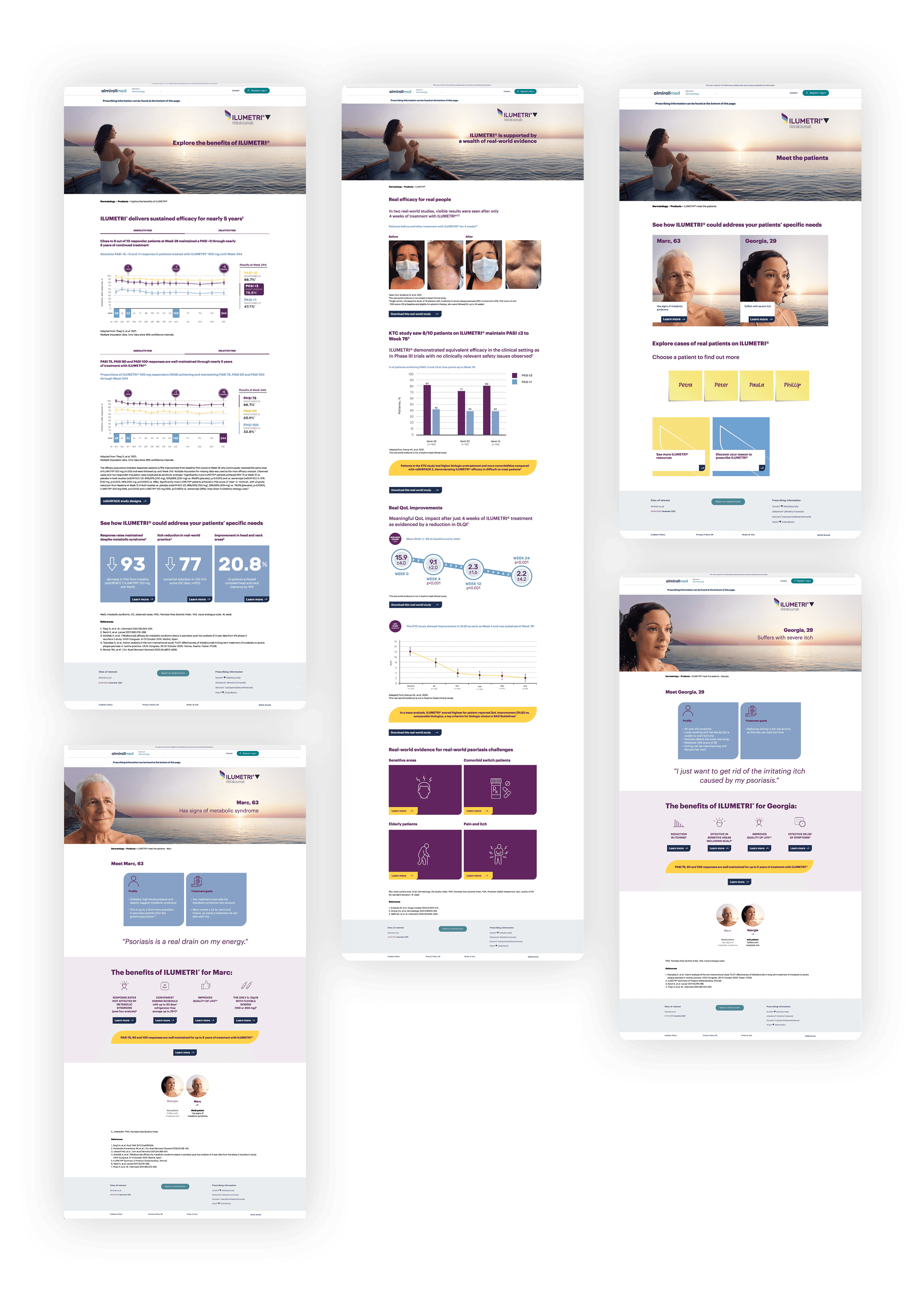
To test and organise the site content a set of wireframes were developed and the structure of the site was agreed upon that ensures smooth and logical navigation.
To test and organise the site content a set of wireframes were developed and the structure of the site was agreed upon that ensures smooth and logical navigation.
Design System
Design System
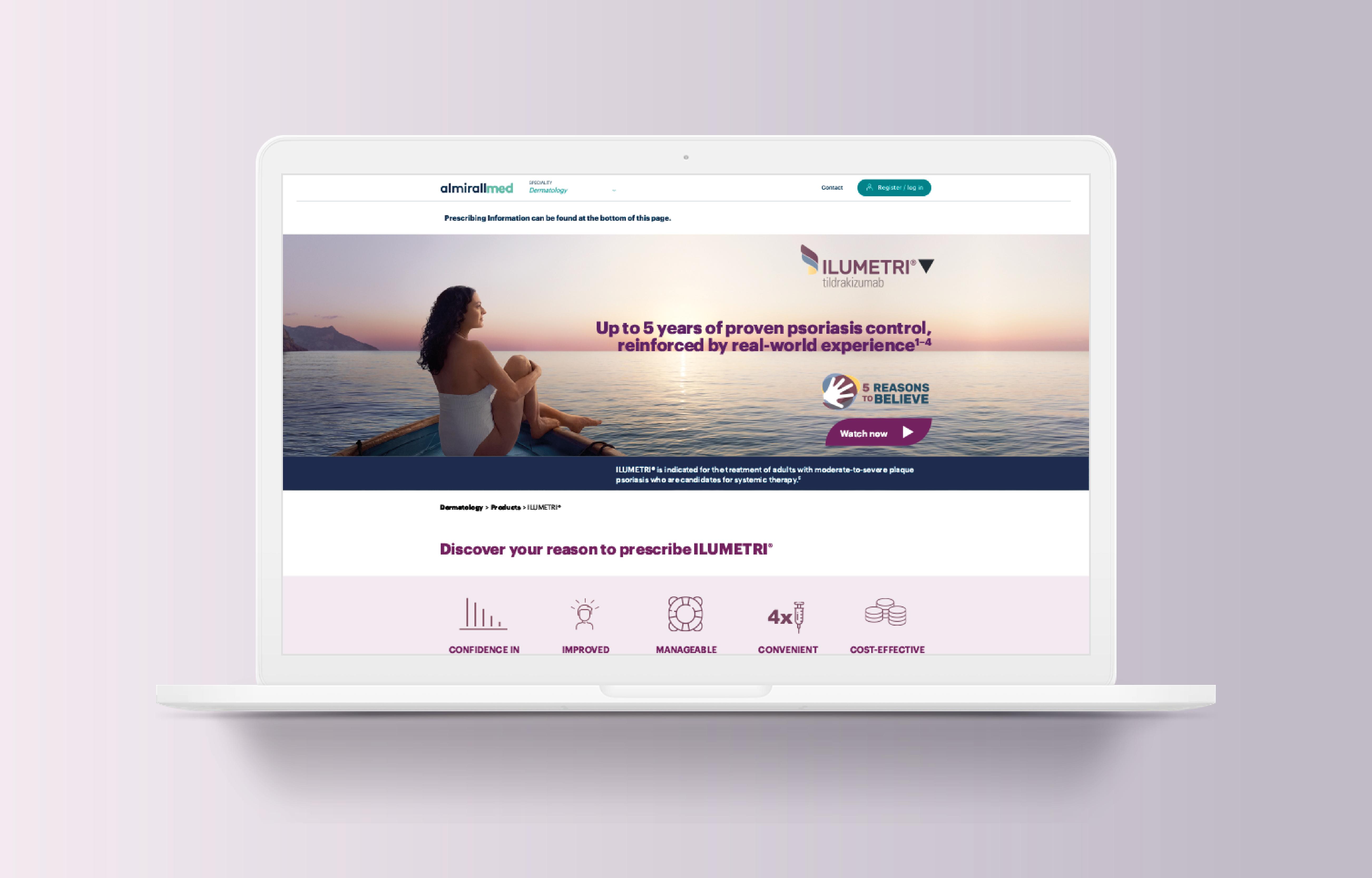
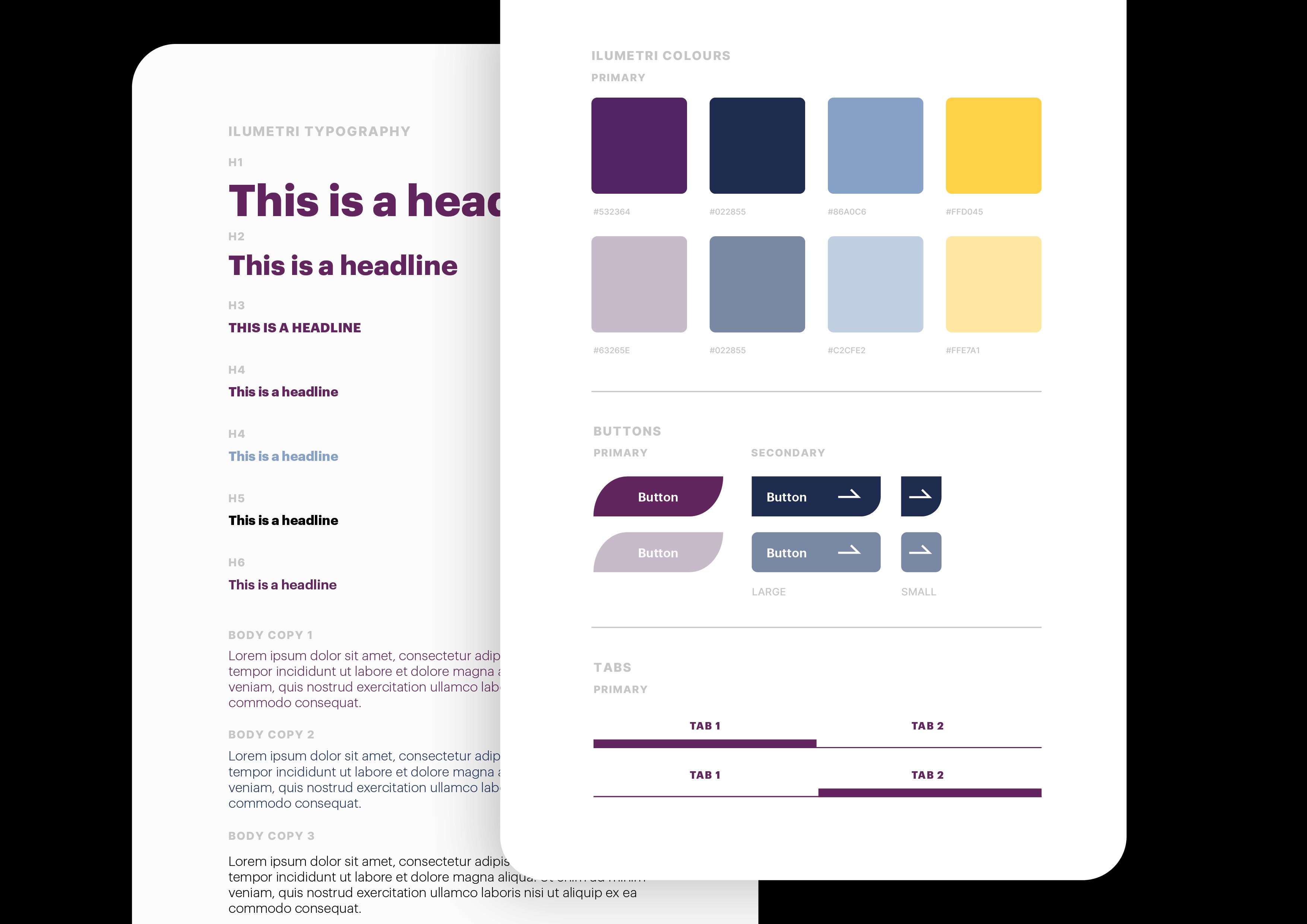
The design system that was adopted made the content look more consistent and ordered utilising boxed content that often came with images to add interest and relevance of the proceeding article. Slight hints of the brand colours like purples and greens were lightly dispersed to separate key statements.
The design system that was adopted made the content look more consistent and ordered utilising boxed content that often came with images to add interest and relevance of the proceeding article. Slight hints of the brand colours like purples and greens were lightly dispersed to separate key statements.
Result
Result
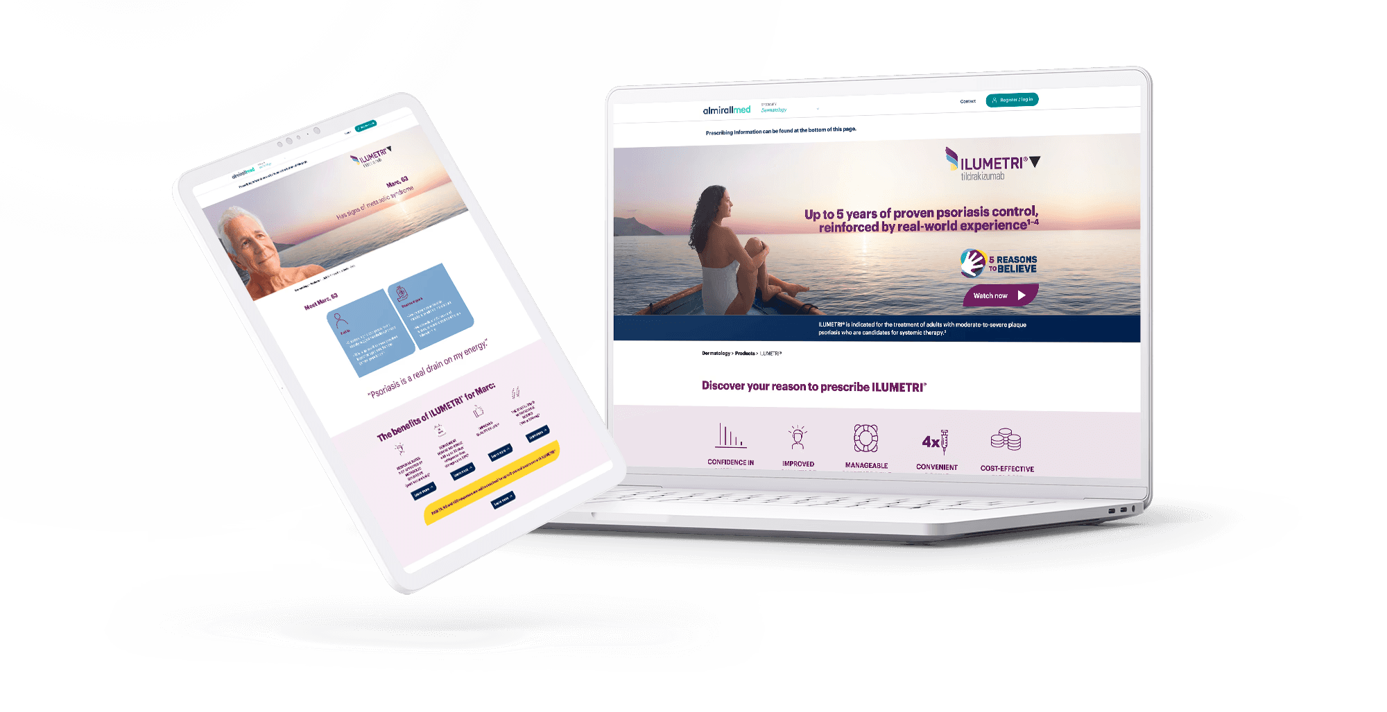
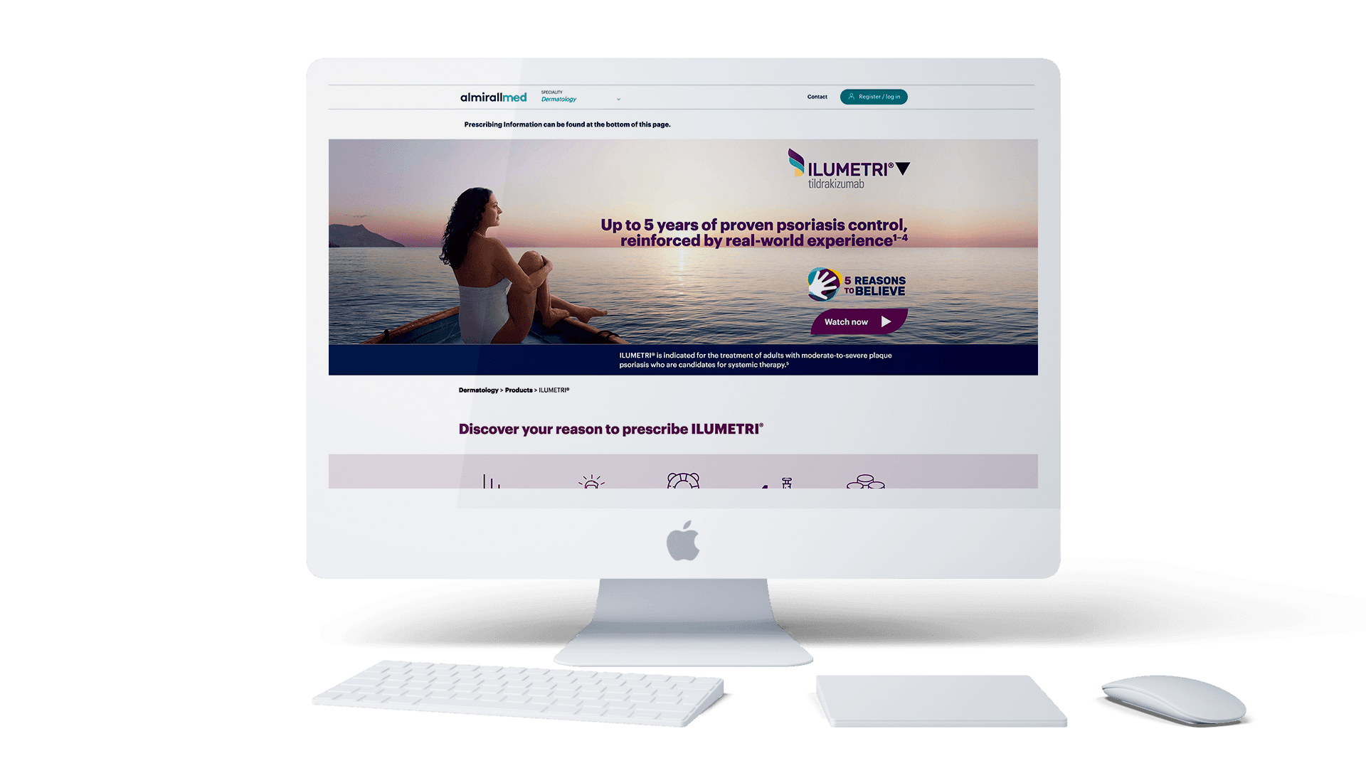
The client received a fresh and clean looking website that was more satisfying and ll the various elements easier to comprehend with a simple structure that allowed HCPs more freedom to get to information faster and deliver accurate solutions for their patients.
The client received a fresh and clean looking website that was more satisfying and ll the various elements easier to comprehend with a simple structure that allowed HCPs more freedom to get to information faster and deliver accurate solutions for their patients.
© 2025 Anastasia Mond. All rights reserved.