Teva AJOVY®
Interactive Plinth Panel
Teva AJOVY®
Interactive Plinth Panel


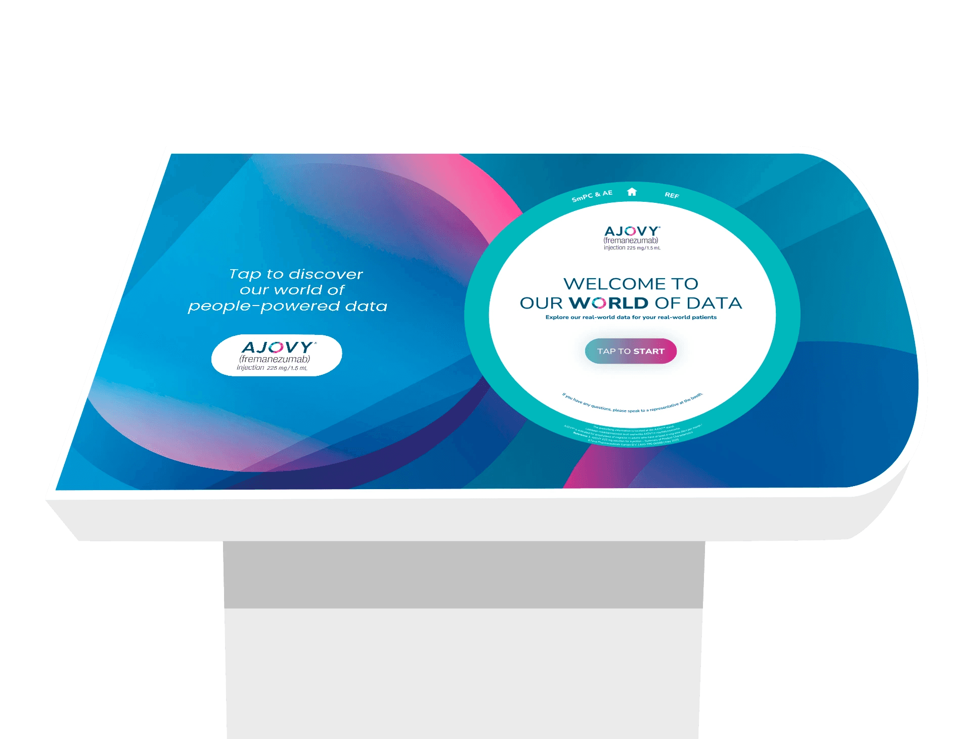
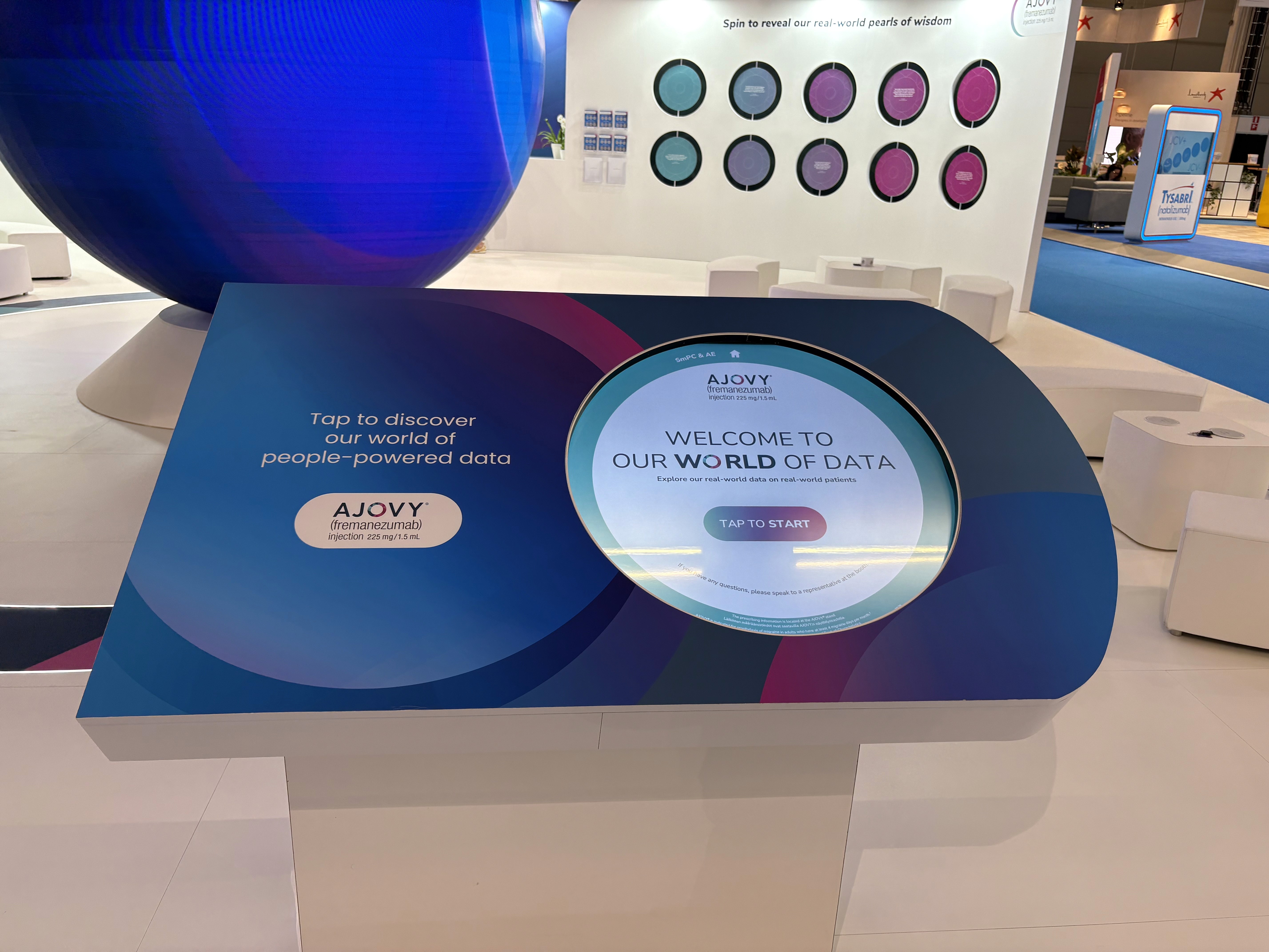
For the EAN Congress in Finland I was tasked in creating a circular interactive plinth panel that would showcase Teva's AJOVY® migraine data.
Client
Teva
Role
UX/UI Designer
Brief
Design an interactive plinth panel for congress.
Client
Teva
Role
UX/UI Designer
Brief
Design an interactive plinth panel for congress.
Client
Teva
Role
UX/UI Designer
Brief
Design an interactive plinth panel for congress.
Challenge
Challenge
To design a circular panel so that viewers can enjoy learning more about Teva's AJOVY® data.
To design a circular panel so that viewers can enjoy learning more about Teva's AJOVY® data.

Solution
Solution
An easy to use contact form was created that allowed users access through their desktop in order to test their site's functionality.
An easy to use contact form was created that allowed users access through their desktop in order to test their site's functionality.

Design Process
Design Process
An easy to use contact form was created that allowed users access through their desktop in order to test their site's functionality.
An easy to use contact form was created that allowed users access through their desktop in order to test their site's functionality.

Testing
Testing
Some design elements were designed and formed into a cohesive and unified design system that was reused in the final iteration.
Some design elements were designed and formed into a cohesive and unified design system that was reused in the final iteration.
Initial Testing
Final Testing
Result
Result
The interactive screen was featured in the EAN Congress in Finland.
© 2025 Anastasia Mond. All rights reserved.
